Charles Schwab - Education Center: LEARN
Empowering new and seasoned investors through a mobile-first, interactive learning hub integrated across Schwab’s digital platforms.
Project Story
Overview
Role: Lead UX/UI Designer
Platform: iOS, Android, Web
Timeline: 2022
Team: UX, Product, Research, Dev, QA
Platform: iOS, Android, Web
Timeline: 2022
Team: UX, Product, Research, Dev, QA
Project Goal:
After Charles Schwab acquired Ameritrade, our UX Design team was tasked with integrating Ameritrade’s quiz-based education experience into Schwab’s digital platform. The objective was to launch a new LEARN tab to boost customer engagement and increase investor confidence through interactive lessons and quizzes while balancing legacy product expectations and stakeholder sensitivities from the acquisition.
The Challenge
• Lack of interactive, guided educational content within Schwab’s mobile and web platforms.
• Customers migrating from Ameritrade expected familiar, engaging, feature-rich educational tools.
• Needed to drive deeper platform engagement while maintaining clarity and ease of use.
Key Objectives:
• Create a mobile-first learning experience.
• Integrate quizzes, progress tracking, and deep linking via customer emails.
• Deliver cross-platform consistency while improving usability.
My Role & Process
Responsibilities:
• UX/UI design for iOS, Android, iPad, and Web.
• Competitive analysis (Coursera, LinkedIn Learning, Duolingo, Khan Academy).
User flows, journey mapping, and interactive quizzes.
• Moderated user research and usability testing.
• Developer handoff with InVision redlines.
Process Highlights:
• Led competitive benchmarking for interactive quiz experiences.
• Created platform-specific mockups and responsive designs.
• Collaborated with research to validate UX decisions.
EDUCATION CENTER & INSIGHTS
Hub, Lessons, Courses, Quiz • Key Screens & Deliverables
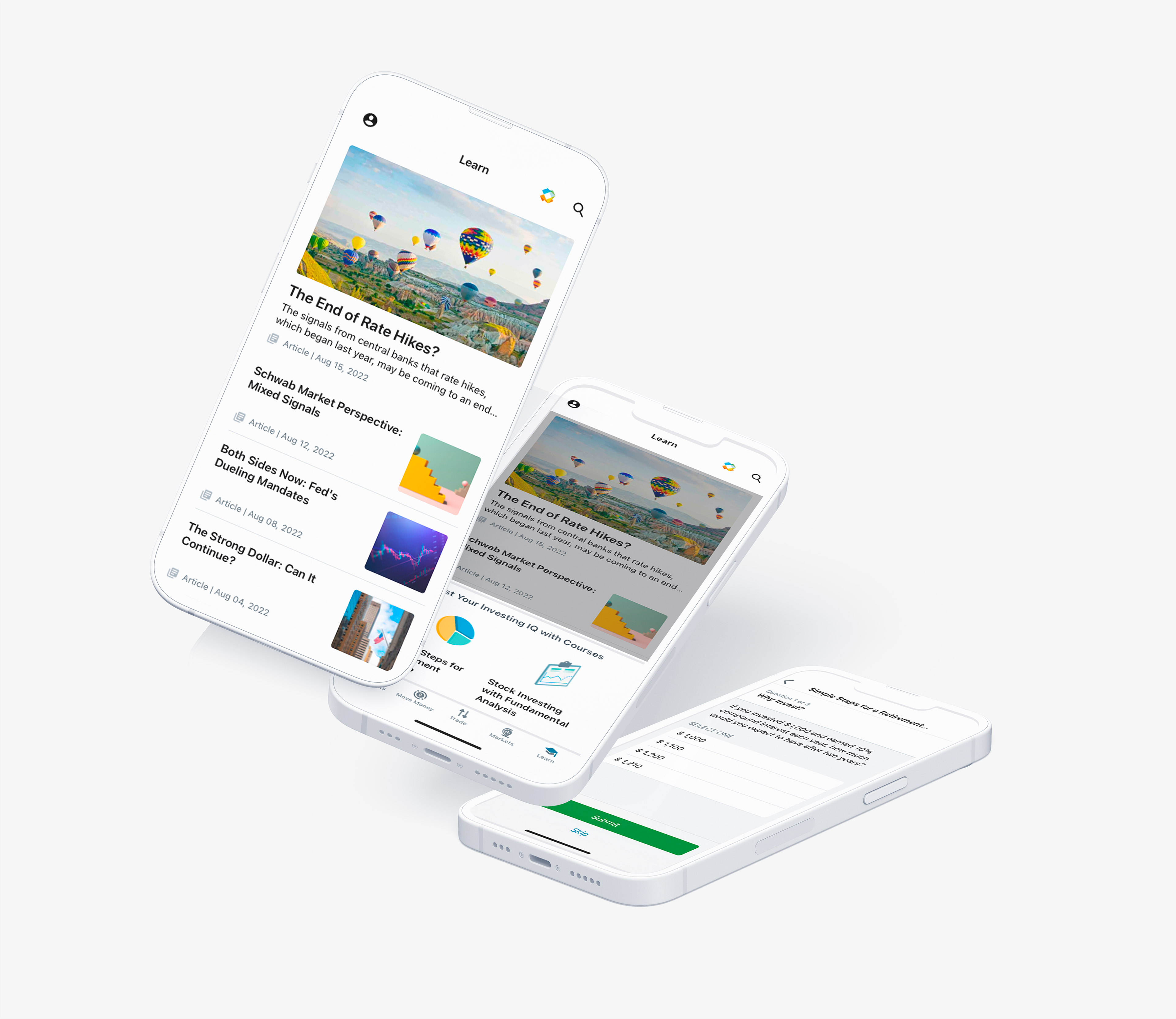
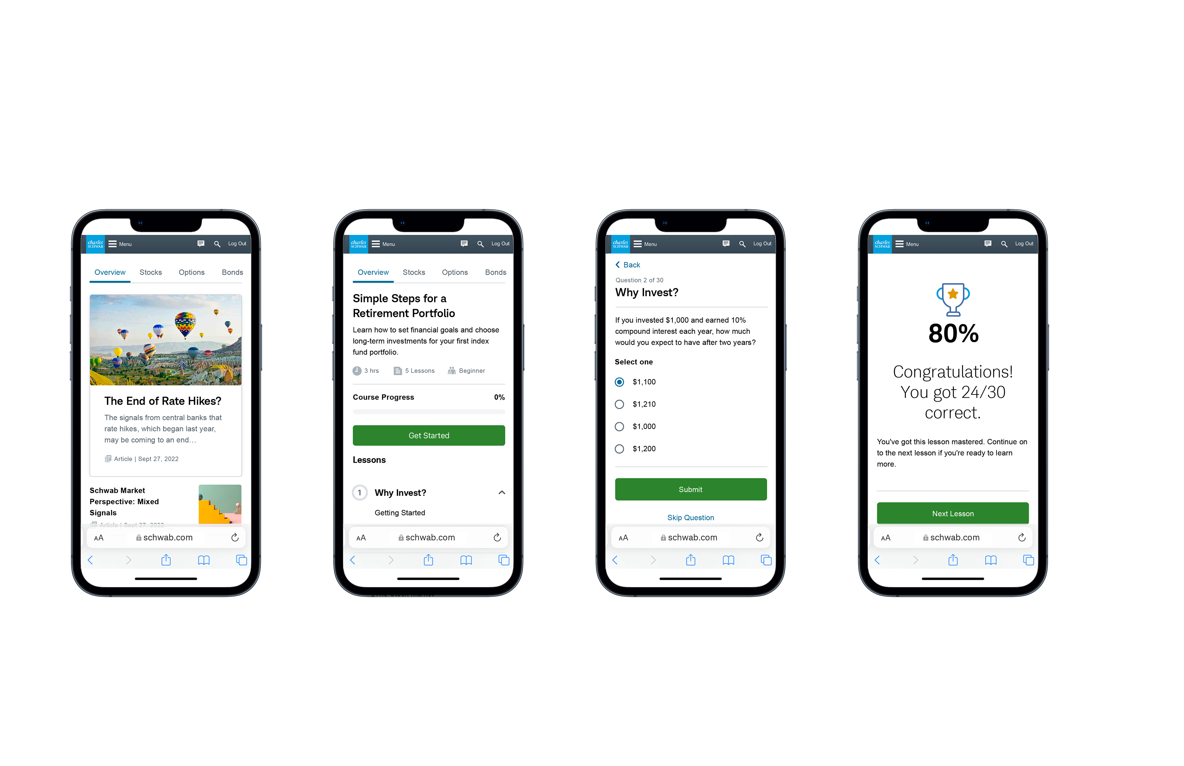
Android, iOS, and iPad App
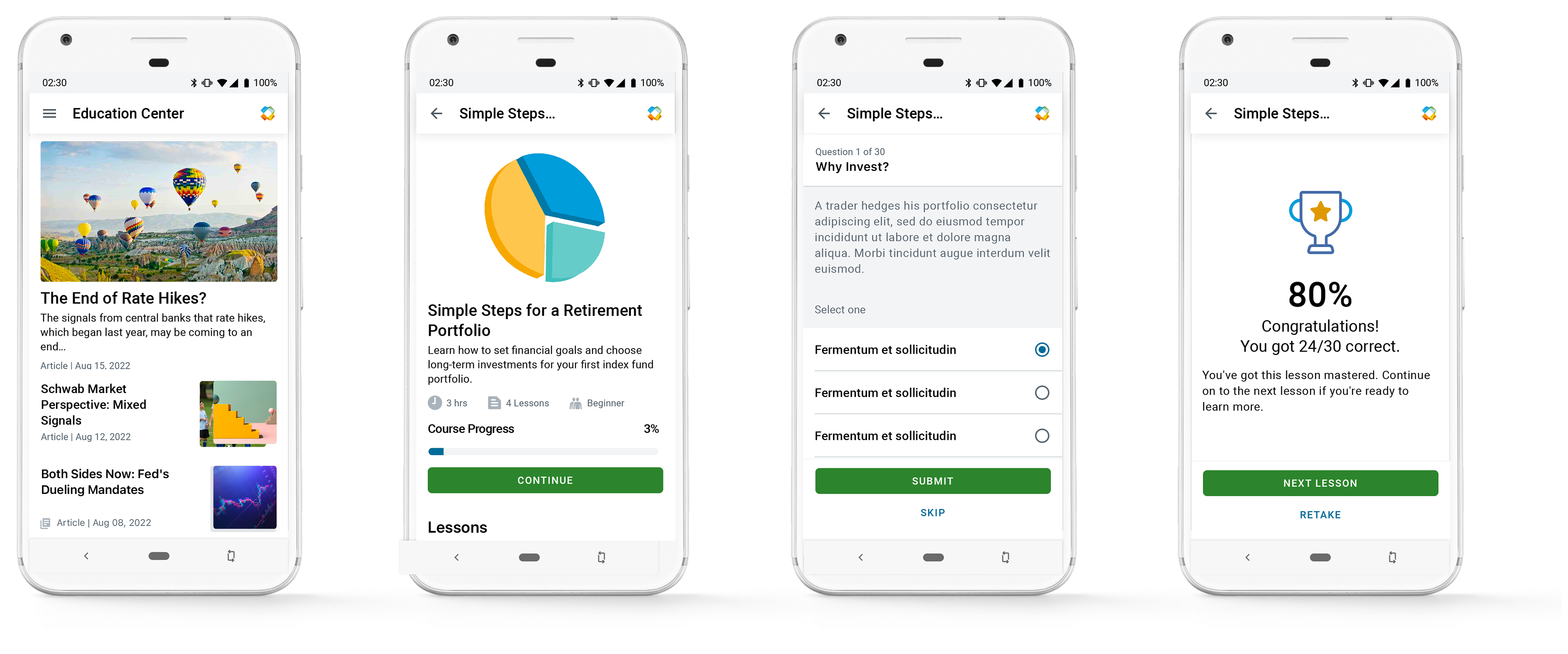
ANDROID

iOS
iOS Tablet
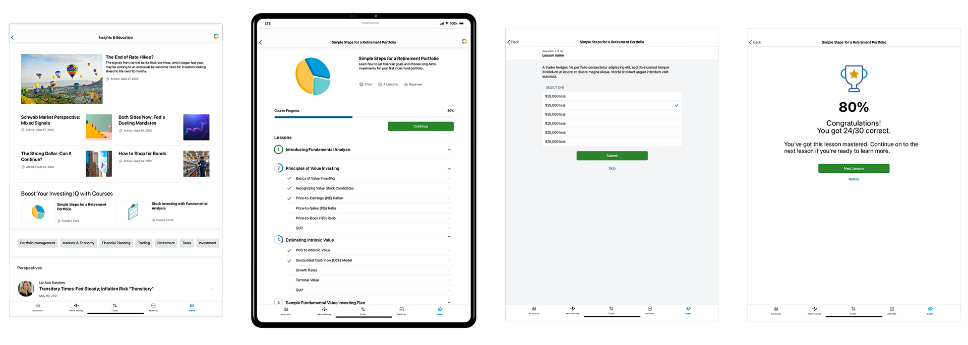
WEB - Tablet Web Responsive • Mobile Web Responsive • Desktop Web Responsive
Tablet Web Responsive
Phone Web Responsive

Desktop Responsive
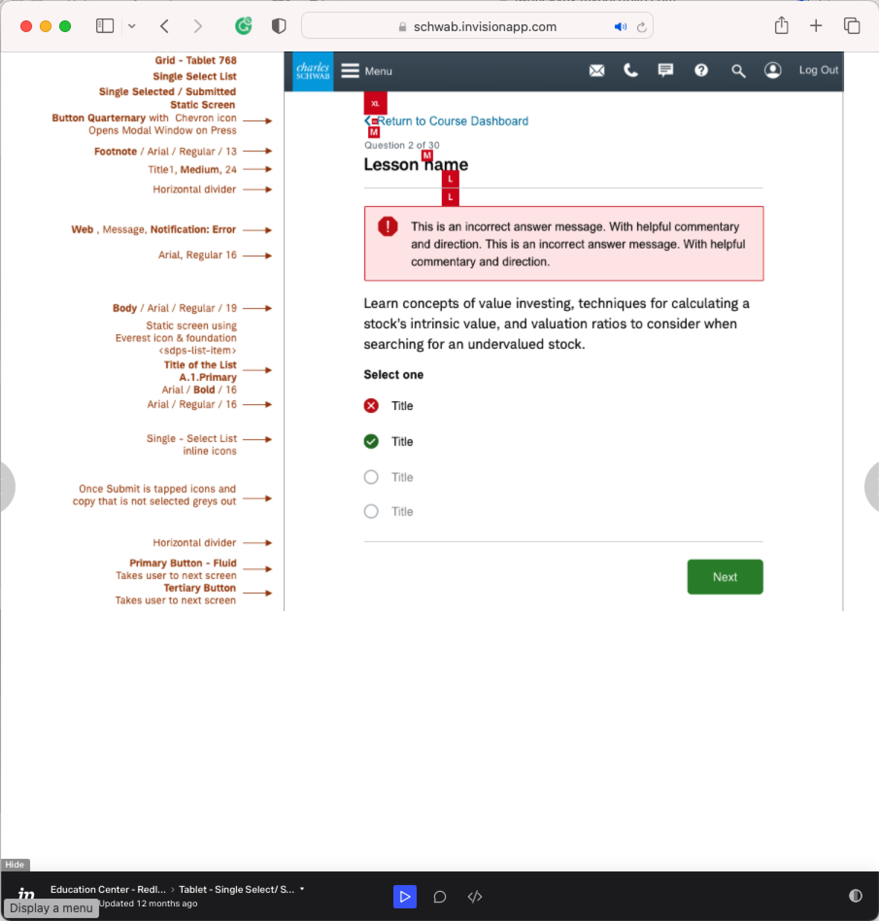
Detail of Components

Quiz

Course Entry Point on Hub

Video on Demand
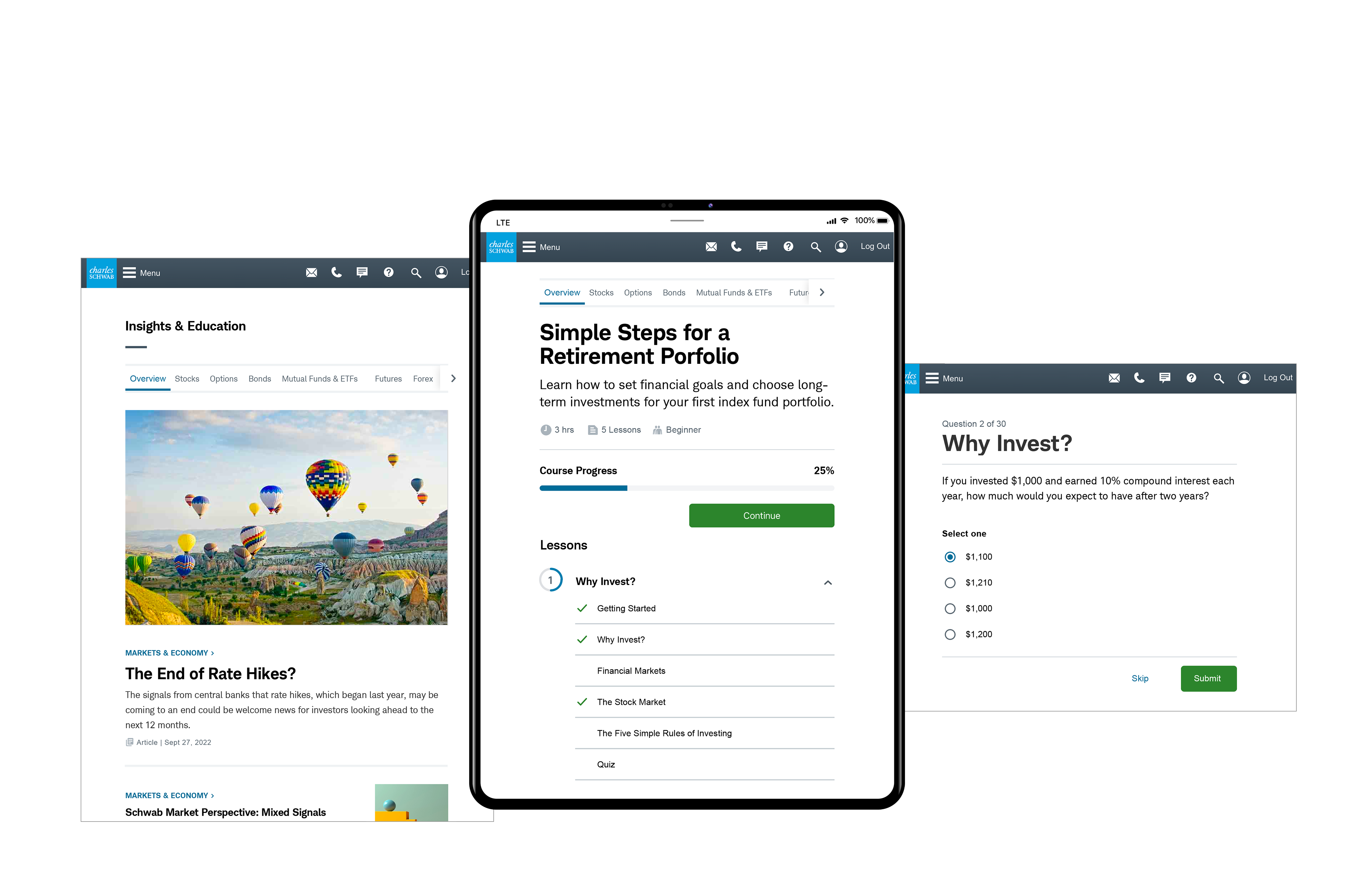
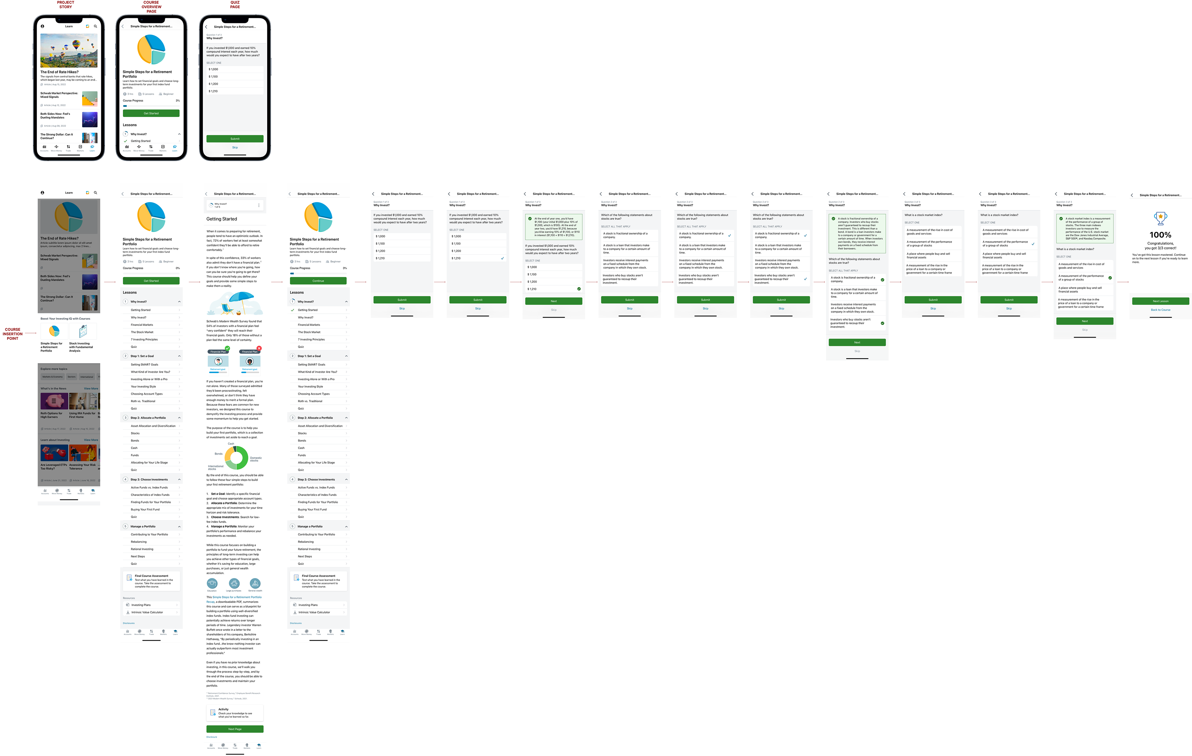
EDUCATION CENTER OVERVIEW
COURSE USER FLOW
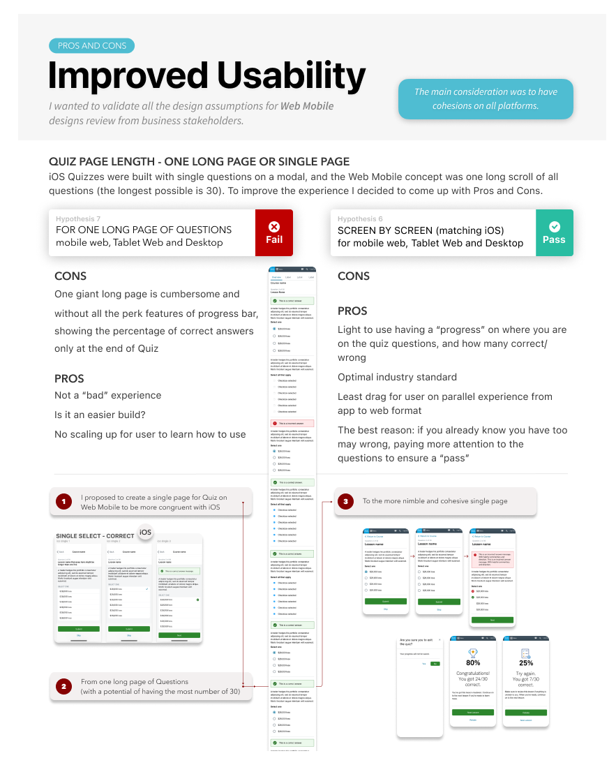
IMPROVED USABILITY FOR WEB MOBILE QUIZ
Quiz comparison layout (single-page vs. multi-page question layouts).
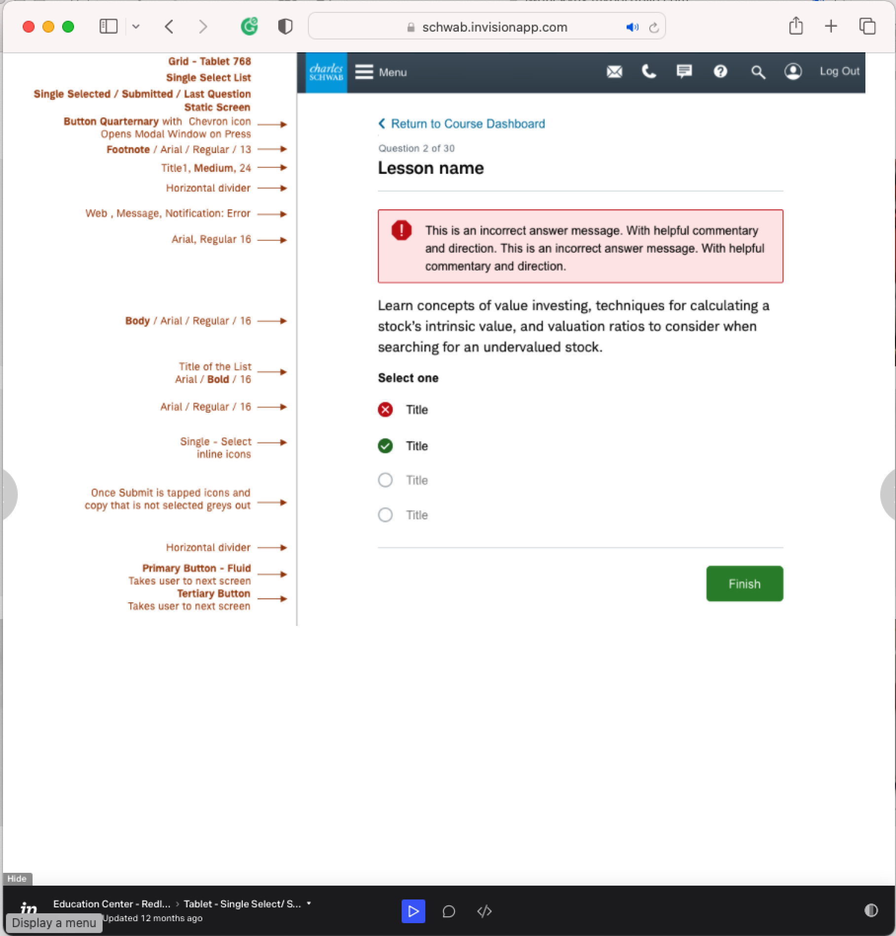
InVision developer redlines
Each screen variation shows documentation and redline spacing designed for each break.
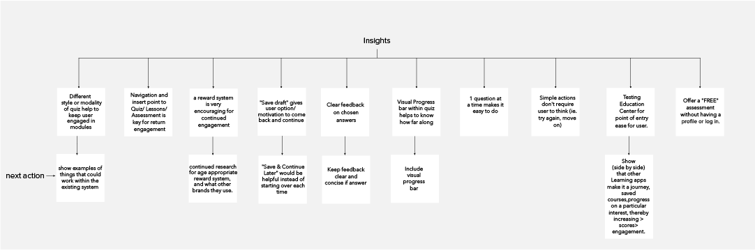
Research & Insights
Competitive Analysis:
• Evaluated Coursera, Duolingo, Khan Academy, LinkedIn Learning.
• Insights on navigation, quiz formats, UX micro-interactions, and motivational cues.
User Testing:
• Moderated usability testing with 11 participants.
Key findings:
Users preferred clear labels and visible progress.
Single-question-per-page format reduced cognitive load.
“Review” and “Continue” options are needed at the end of the lesson.
Visual: Comparative UI screenshots + interaction samples
Key Takeaway:
A guided, simplified quiz experience improved clarity, user confidence, and completion rates.
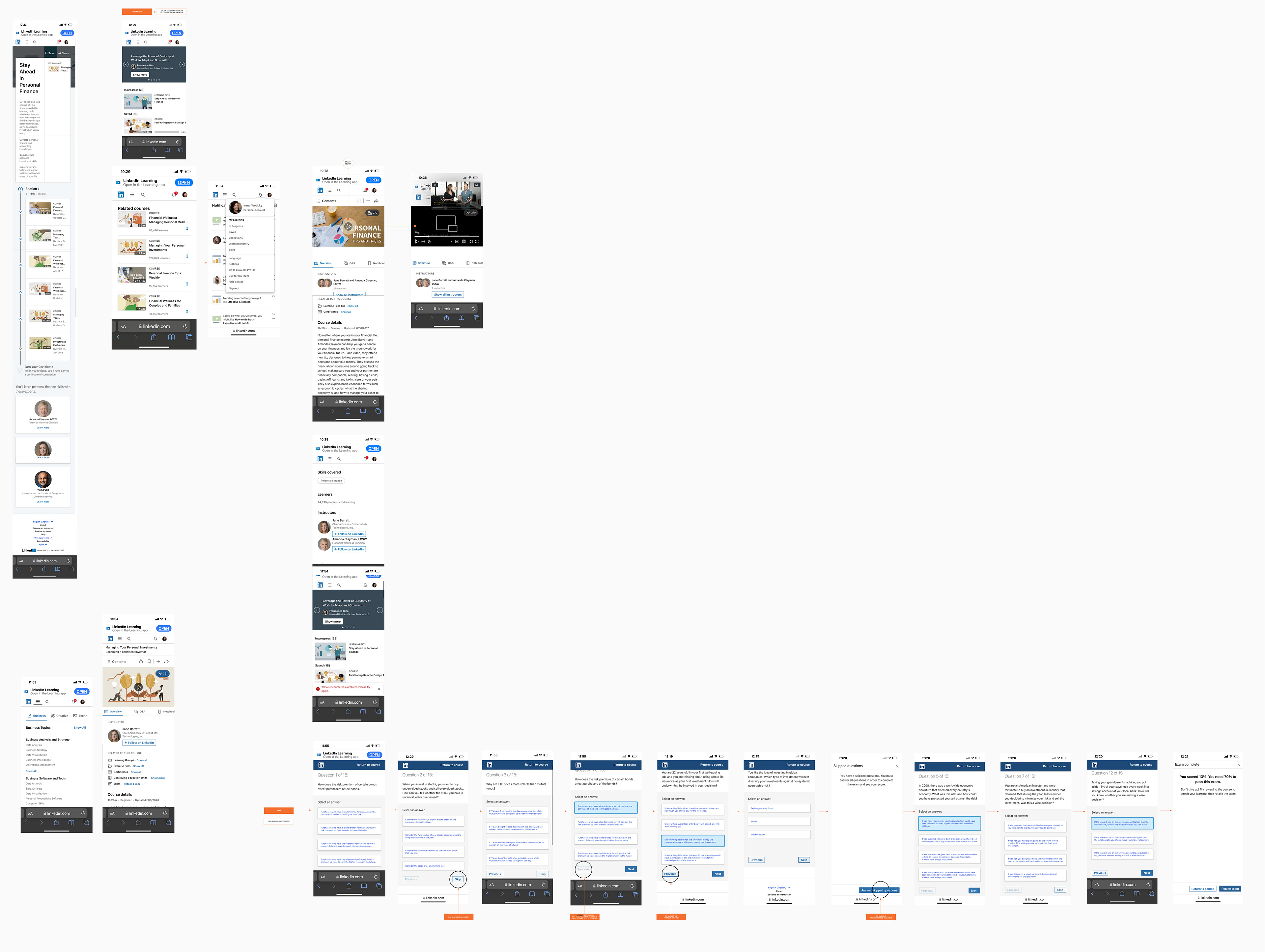
LinkedIn Learning - Desktop User Journey and Navigation
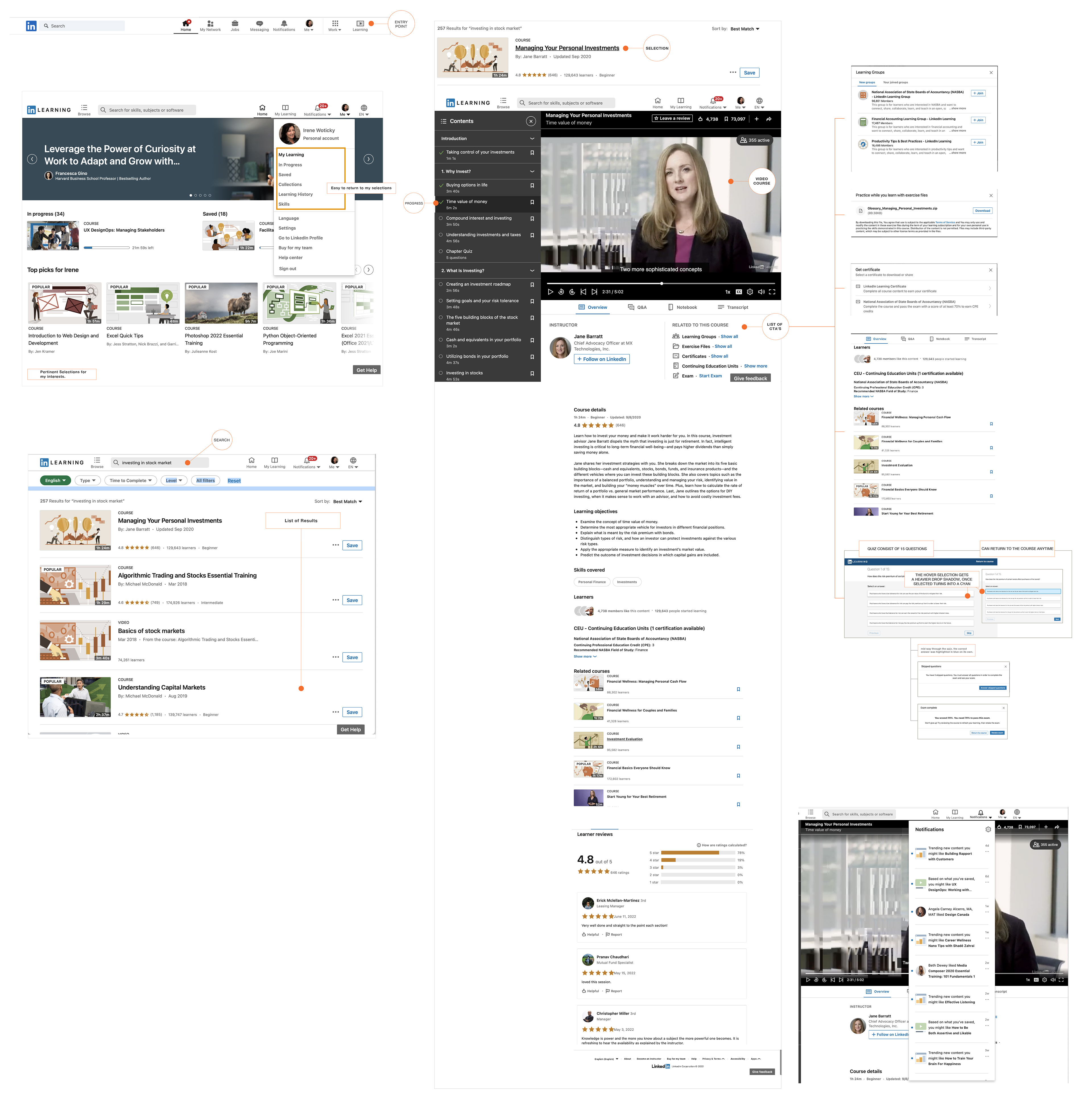
Desktop
Web Mobile
iOS
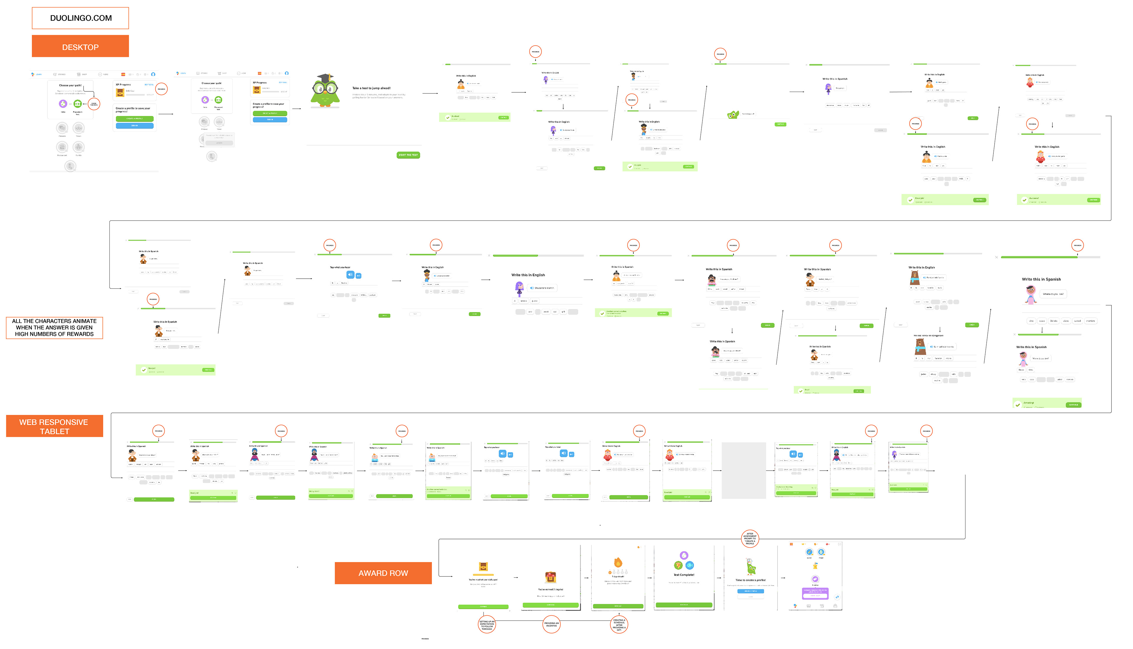
Duolingo - Desktop & Tablet: User Journey and Navigation
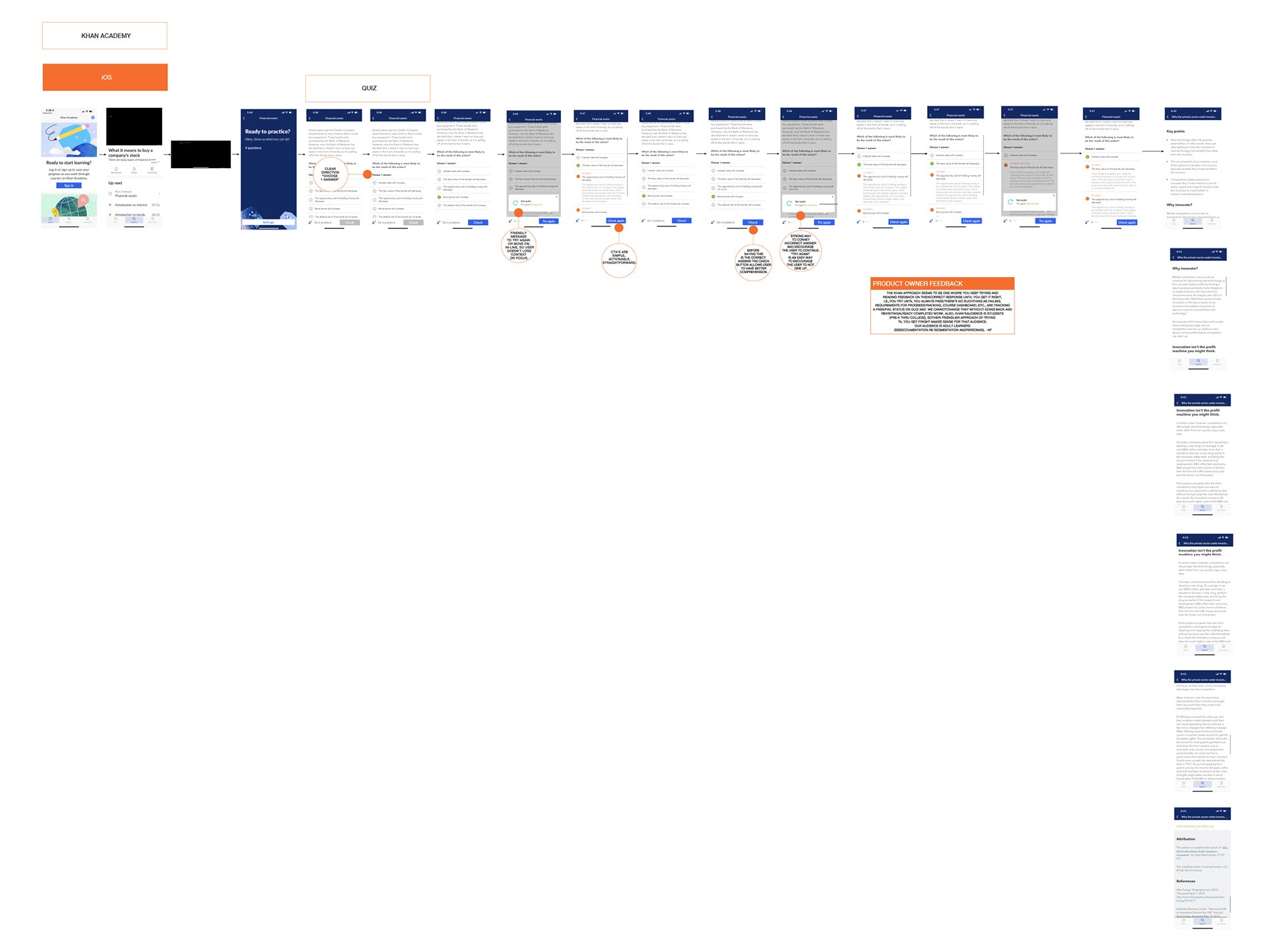
KHAN ACADEMY - iOS: User Journey and Navigation
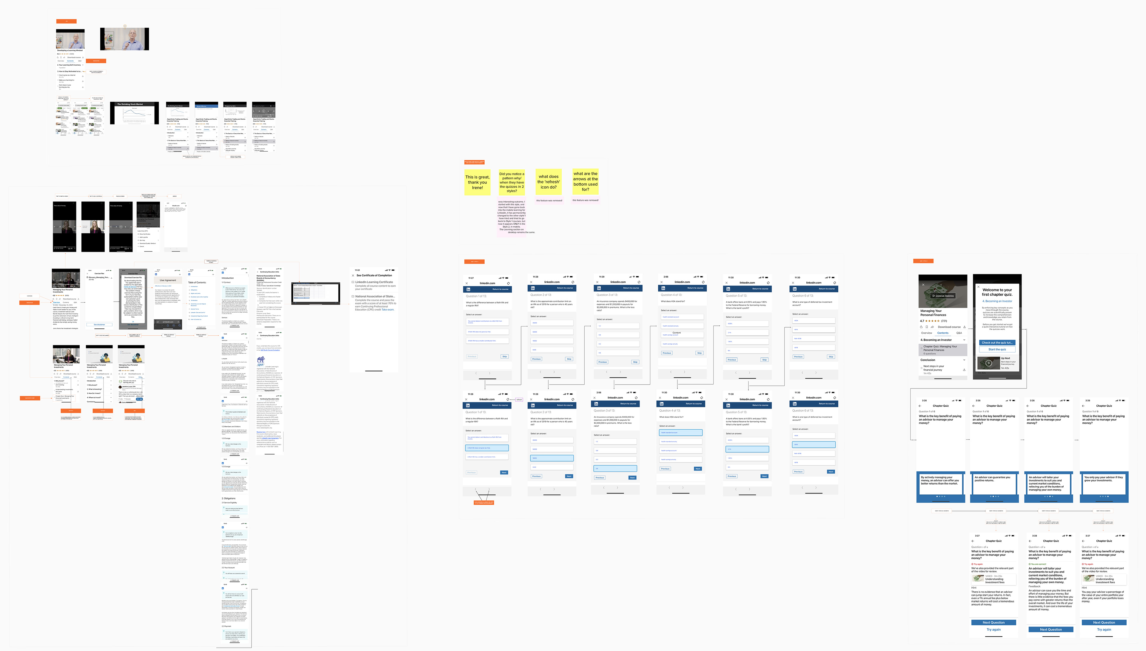
COURSERA - DESKTOP & iOS: User Journey and Navigation
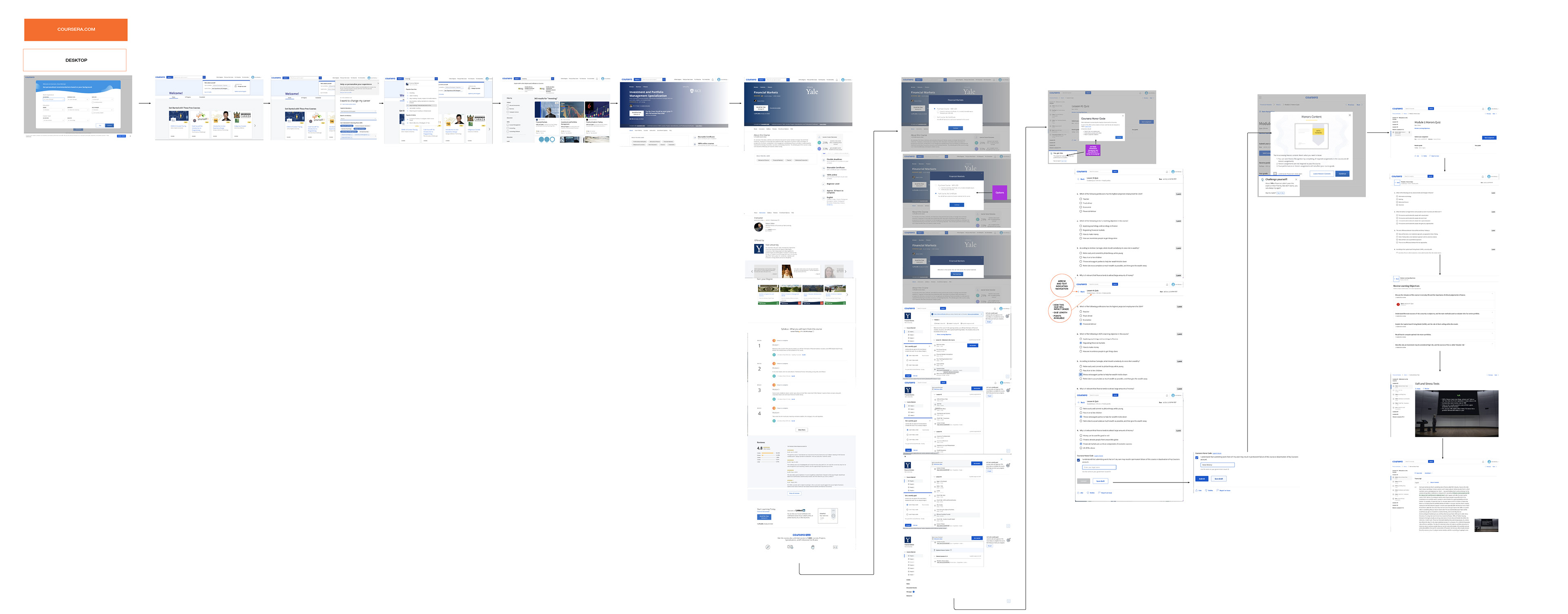
COURSERA Desktop

COURSERA iOS
HOW COURSERA HANDLES A "SKIP A QUESTION"
This is a close-up look at how to demonstrate User Interaction for the micro-interactions for QUIZ.
• Selected
• Incorrect answers and an explanation of why the correct answer is correct.
• This is how Coursera (competitor) handles "SKIP", as well as an encouraging note with a hint of gamification.
Competitive Research Insights
MODERATED USER RESEARCH (shown 1 of 11 people interviewed)
The goal of the Learning Path Flow (Dual Device) Usability Moderated Study is to understand if users can navigate the learning path flow as it is currently designed.
We evaluated the usability of the learning path based on Layout and Ease of Use. The success of the learning path flow will be evaluated by participants' ability to execute tasks of each step of a pre-selected path.
Users should feel confident about what to expect when clicking on Continue. Most users felt they had finished Why Invest?, which informed their expectation to land on The Stock Market after clicking on Continue.
We can provide options with clear labels to Continue to Why Invest? or Continue to The Stock Market. Some users may want to review Why Invest? And some users may want to proceed.
Final Design Solution
• Mobile-first, interactive course hub.
• Quiz experience optimized with single-question layout.
• Integrated educational progress tracking.
• Deep linking via personalized content emails.
• Cross-platform visual and functional consistency.
Result:
✔ Increased user engagement with educational content.
✔ Positive feedback on clarity and ease of navigation.
✔ Delivered parity and feature improvements compared to Ameritrade.
Outcomes & Impact
• Successfully deployed Q1 2023.
• Positive beta feedback from Ameritrade transfer customers.
• Foundation for future education content expansion.
Tools Used
Figma, InVision, Miro, Confluence, Jira, Adobe CC, Google Analytics, Microsoft Teams (for moderated testing)
Reflection
The LEARN tab challenged me to balance simplicity, cross-platform scalability, and user motivation. By focusing on guided experiences and clear progress paths, we increased confidence in new investors while maintaining consistency for loyal Schwab customers.